It's time for the latest edition of the Card Concept Challenge...we had 172 entries for Challenge #4 and some very beautiful winners you can view HERE. I hope your card is among them, but what a difficult time it was to choose! It is obvious everyone loves flowers! Today though, for Challenge #5 we have a color challenge for you.
Not only are the colors rich and decadent...but so are the yummy cake pops in the inspiration photo. What will you see this week? Will you focus on the round shapes, the swirls or the layers created by the white sticks? What card style will you be making? Here are the six Card Concept card styles our design team highlights every challenge:
Clean and Simple
Clean and Layered
Clean and Graphic
Shabby and Vintage
Freestyle Collage
Classy and Elegant
Want to know more about each style? They are all described HERE at the Card Concept Blog.
Here is the card I created this week representing the Classy and Elegant card style:
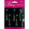
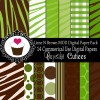
I was inspired by the circular shape of the yummy cake pops and the decadent rich chocolate and green colors of the inspiration photo. I used some digital patterned paper for the base and the swirliest and most delicate die I own (Quinn Flourish) to represent the beautiful swirls on the cake pops. To make it classy and elegant I added lots of rhinestone bling and even a dangly gem embellishment I have had for quite a while now...finally had the right card to use it on.
You have lots of time to play along with our challenge...it closes on Tuesday, March 18th at noon PST. If you would like a little more inspiration...please go see what the other Card Concept Design Team have created using this week's delicious color pallette.
We also have a guest designer this month:
Lesley Croghan, the genius behind this fabulous Card Concept Challenge. Please stop by her blog and let her know how much you love this challenge!
We also have a guest designer this month:
Lesley Croghan, the genius behind this fabulous Card Concept Challenge. Please stop by her blog and let her know how much you love this challenge!
Clean & Simple
Clean & Graphic
Shabby Chic
Classy & Elegant


18 comments:
Oh Cathy ,it's beautiful ! You sure used some delicate dies. I love the beaded pendant hanging from the flourish.
Blown.away.
How pretty Cathy, what fun patterns! Those fancy bangles really add flare, great job!
This is so amazingly pretty, love the style added with those bangles !! Just wow :)
Absolutely gorgeous!!! What an amazing card Cathy...love, love that green and it really looks fabulous with the deep espresso. I don't think any card could be more elegant than this!
So pretty, Cathy! And you know what I really like? Where you placed the rhinestones! :-)
Stunning! The dangling beads are beautiful and I am amazed at the perfectly clean cuts of the intricate dies! I also LOVE the burlap photo background - beautiful way to showcase your card!
Wow - this is beautiful! What a perfect way to combine these colour - I'm totally loving the bling too!
All I can say is WOW Cathy. I love the double die cut and the dingly bling centre. The digital background sets it all off beautifully. A gorgeous card.
I can't stop looking at this fabulous card! I love the pop of the bright green die cut, and the bling is awesome.
Beautiful details, all the tiny rhinestones and that medallion !
This is so pretty--classy and elegant, too. Love those dies stacked together, and what a cool element those dangling gems are. Brown and green look fantastic together.
I love everything you create, Cathy. You are such a dear and all of your comments and support are appreciated. Gorgeous card! xx
WOW! Cathy,this card is AMAZING! I love how you used that pretty die with the bling in the center!! Stunning!!
A great card using these brilliant colors!
Beautiful card Cathy!! THose dies are marvelous and I love the background paper too! Lovely work!
Your background paper looks fabulous--love the chocolate brown & green. And those die cuts are perfect and so gorgeous with the rhinestones and dangly bling!
Cathy, thanks so much for stopping by my blog, and leaving a comment! I thought I'd made a clean and layered card. Thank you for clearing out it is actually a Classy & Elegant. I appreciate it! And by the way, I like your card a lot! That green doily medallion just pops! And matches the patterned paper perfectly!!!
gracielliedesign . blogspot . com
Post a Comment