

The past two years I have been using my craft time for quilting. I know, a new hobby. It came about after my grandkids were born and I saw some soft flannel fabric at JoAnns that was a perfect match for my granddaughters room. How hard could it be to sew little squares together? HARD! That first quilt was a mess but it was enough that I was hooked and I invested in a really nice sewing machine, and all the needed quilting accessories which were paid for in part by selling a huge, huge chunk of my paper crafting supplies. That's why the 12 Kits of Occasions group is so nice...each month's package has everything...and I mean everything you need all ready for you to make some cute cards. I made four with Jeanne's kit and have quite a bit left over to make more.

The intricate die cut was the first piece of Jeanne's kit I used.

One of my all-time favorite dies is the Poppy Stamps Grand Madison Window Die and this cute patterned paper was perfect for a "looking out the window scene."
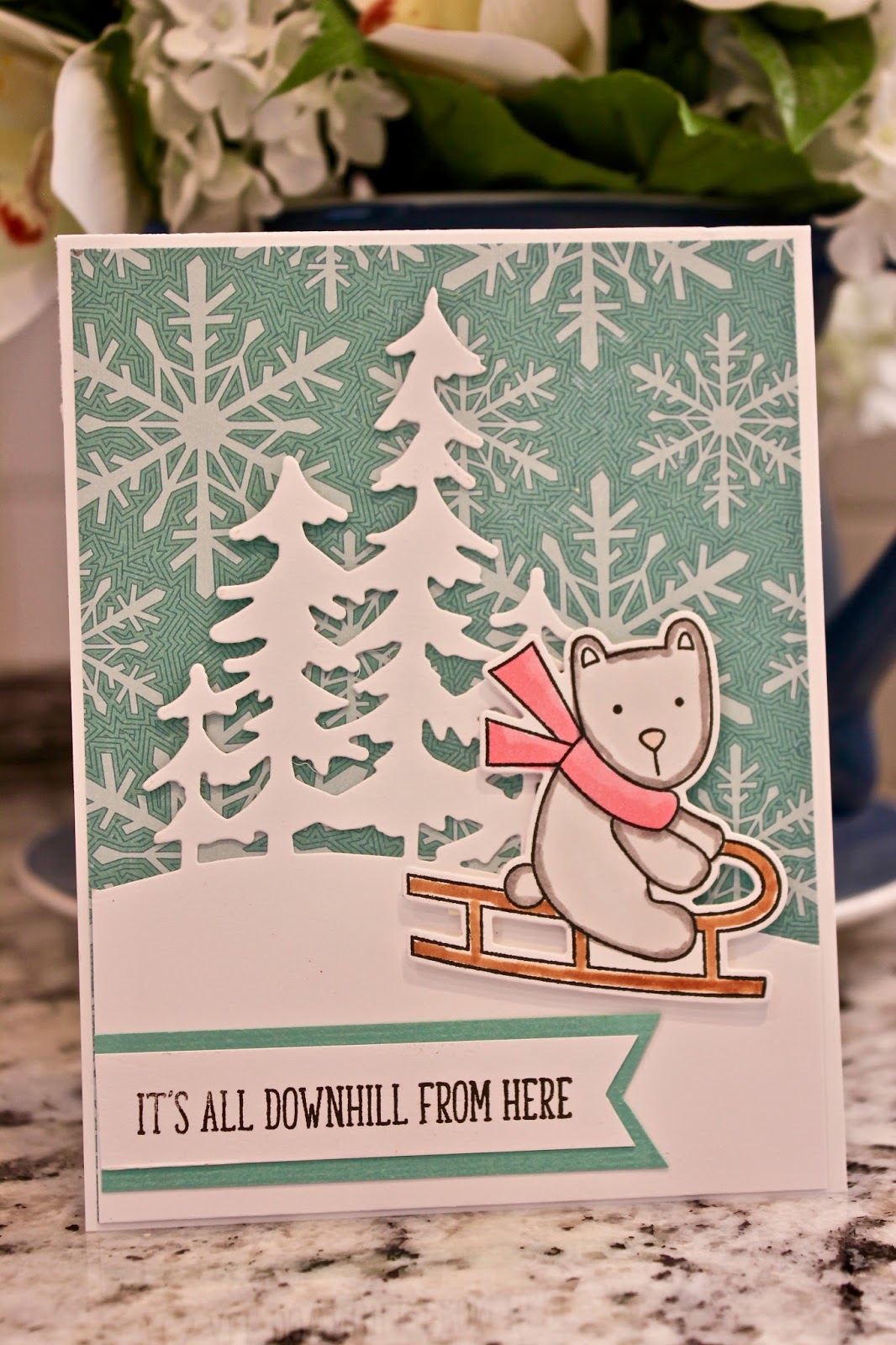
I loved the polar bear and the snowy treetops.

Don't even need a sentiment when your patterned paper has such great wintery sentiments!
I would like to thank Jeanne for inviting me to play along this month...it really felt good to spread out all the materials and play with them. As always, there are some fabulous cards made each month by the 12 Kits of Occasions group and you can find their cards as well as the kit ingredients on the 12 Kits of Occasions blog.
***Some of my crafty friends might want to see what my sweet grandkids look like now. Here's a few pics***
 |
| Jaxon, 3 yrs |
 |
| Blakely, almost 3 |
 |
| Barrett, 6 months |


